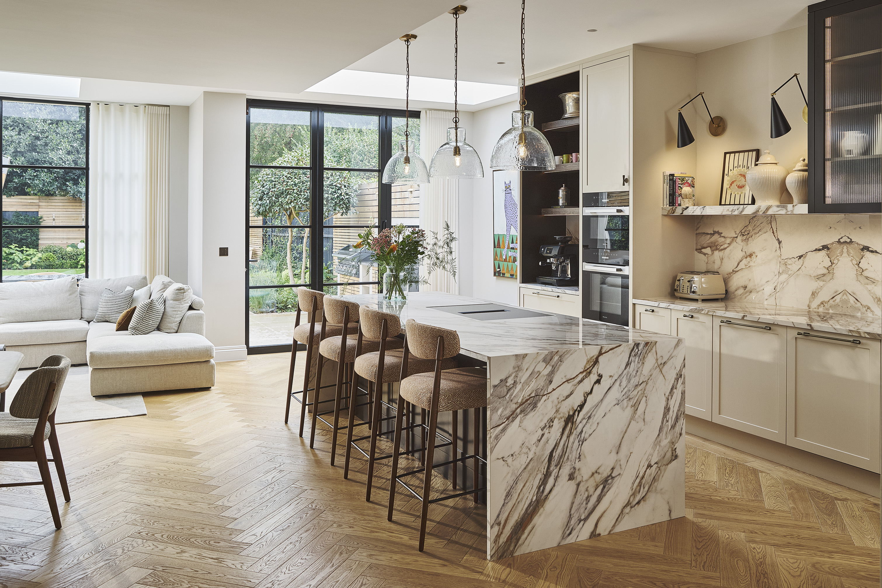
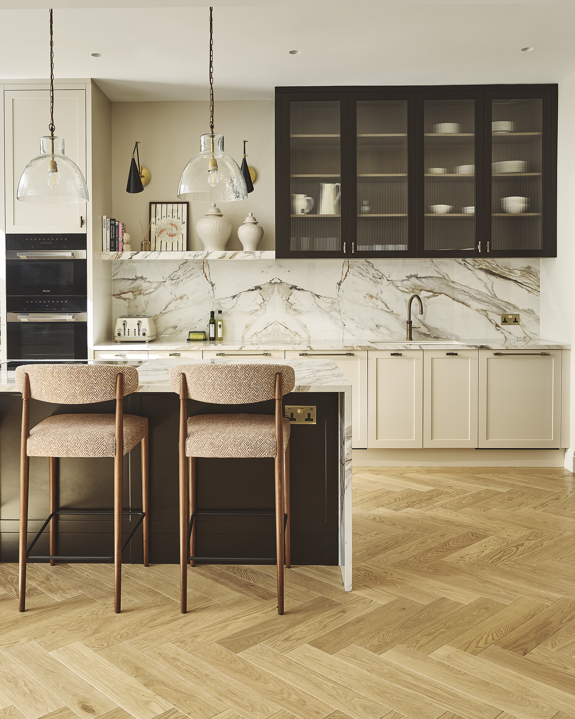
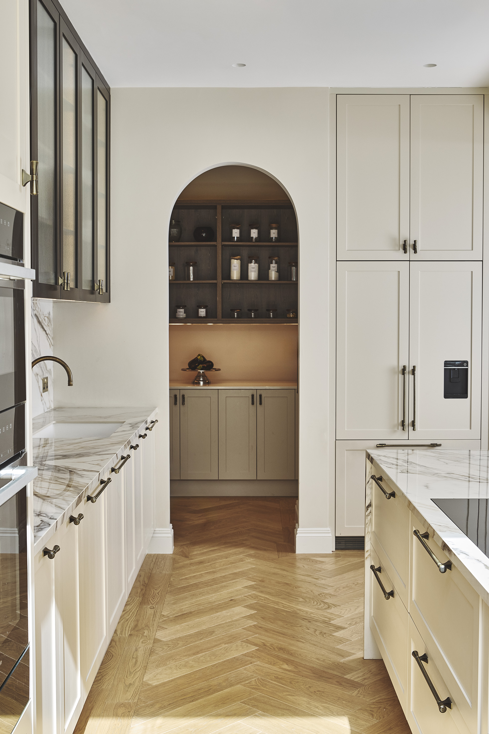
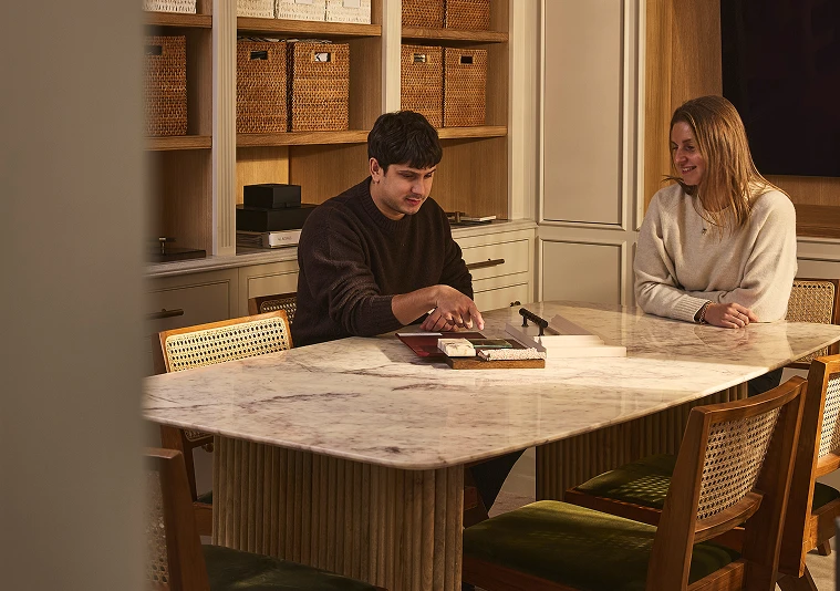
Sitting somewhere between cream, taupe and beige, oatmeal offers the versatility of a neutral while bringing considerably more warmth and depth to a kitchen. Homes & Gardens explores why designers are moving away from stark white in favour of colours that feel more relaxed, considered and connected to the materials around them. Homes and Gardens
It’s an approach we’re seeing more and more in our own work.
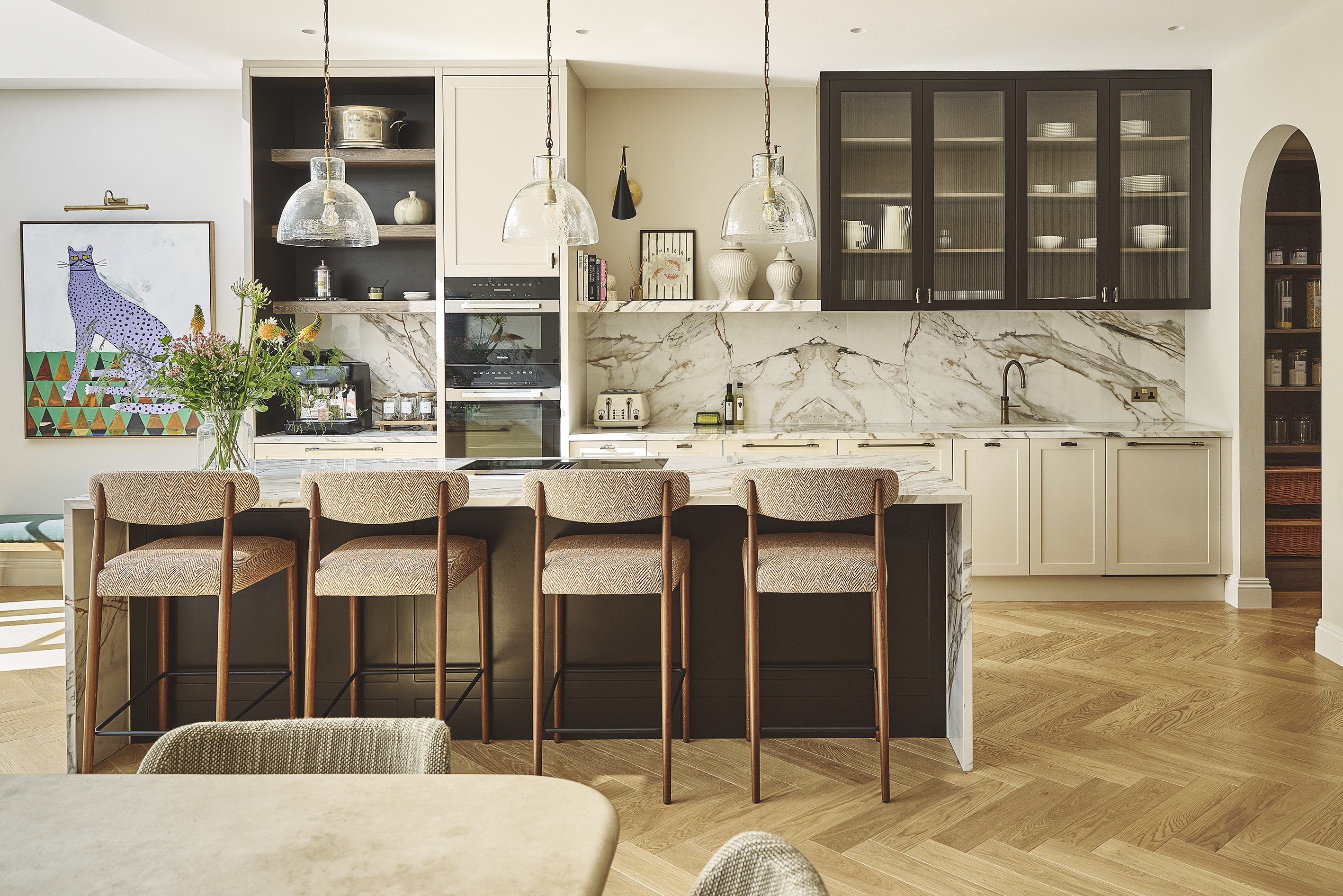
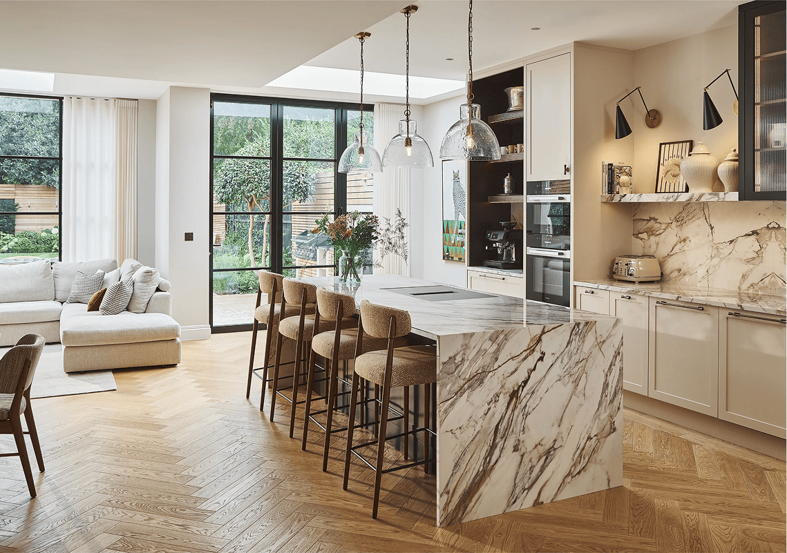
Our designer Matthew Andrews explains that Little Greene’s Rolling Fog Light works particularly well because of its subtle warmth. Unlike stark white, which can feel cool in north-facing rooms, the shade has enough depth to counteract blue tones and create a softer atmosphere.
We also love how the colour changes throughout the day. In bright natural light, it reads as a calm, understated neutral. As the light becomes warmer in the evening, it takes on a richer, more cocooning quality.
For us, the key is what sits alongside it.
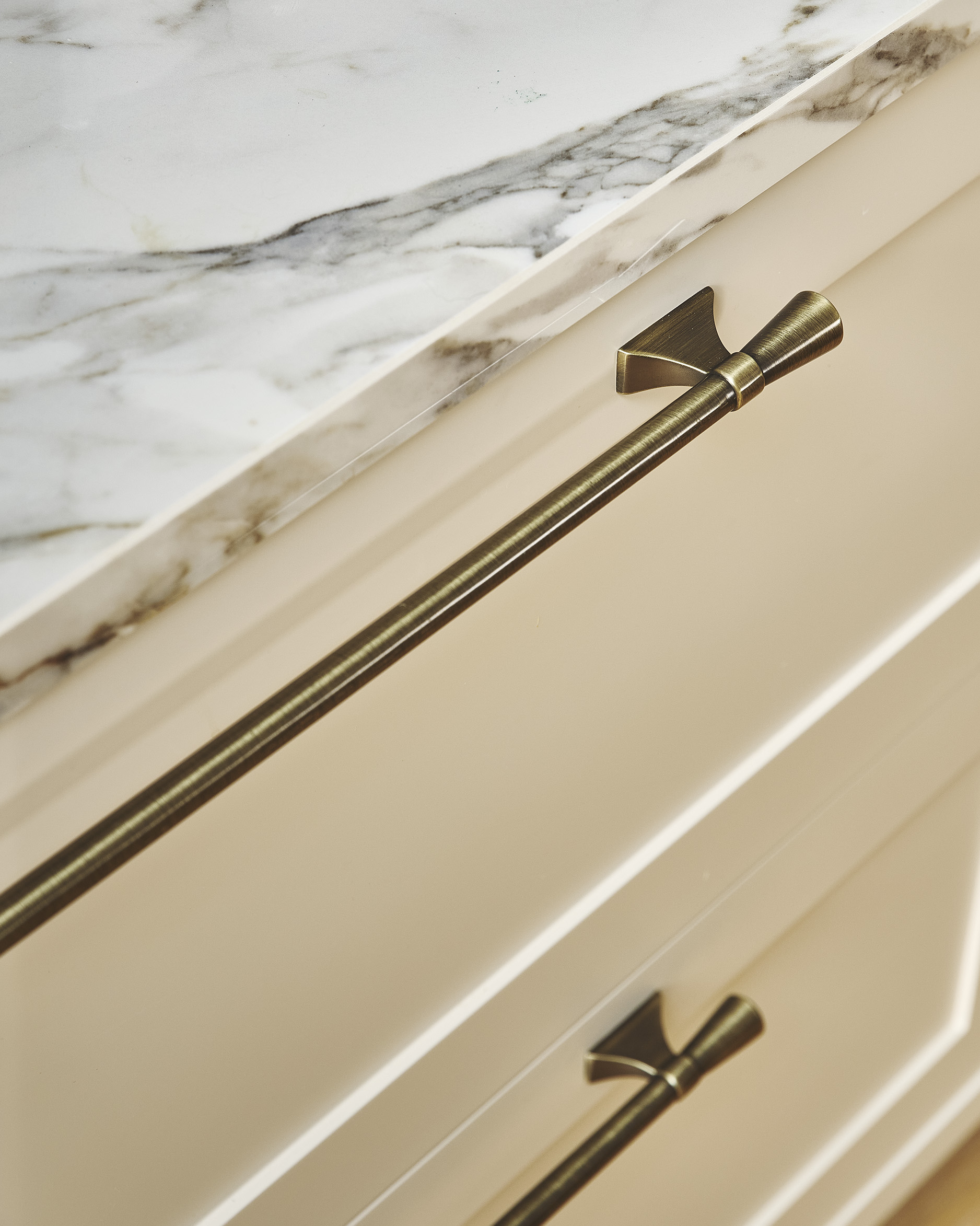
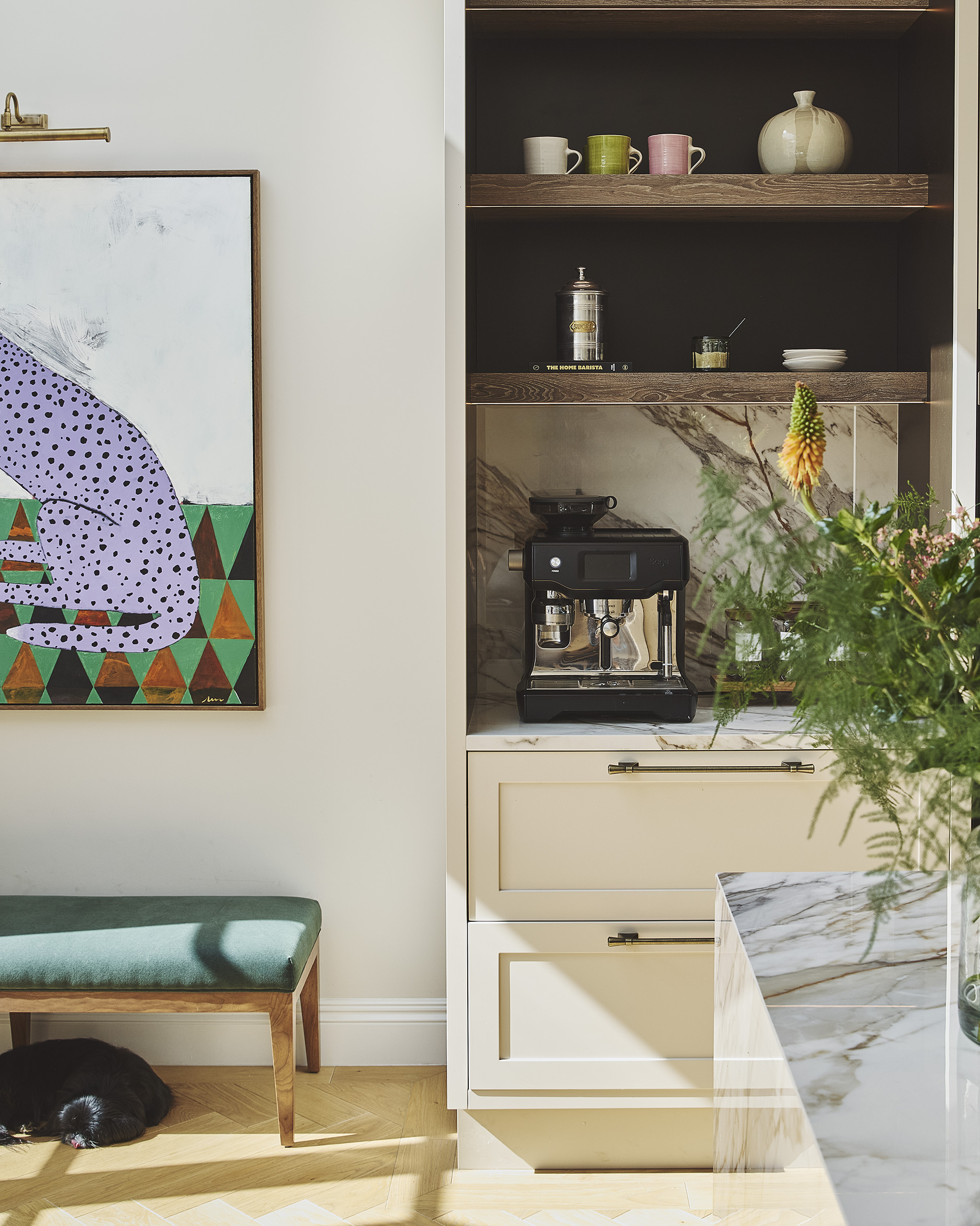
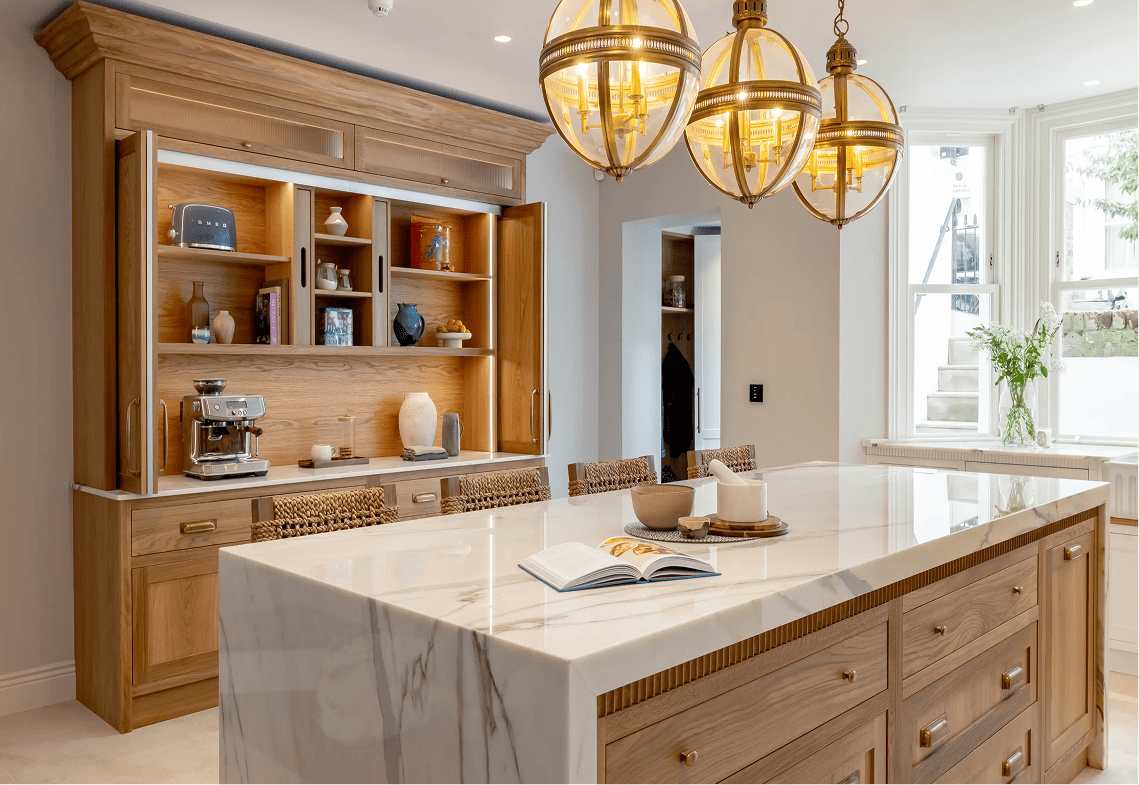
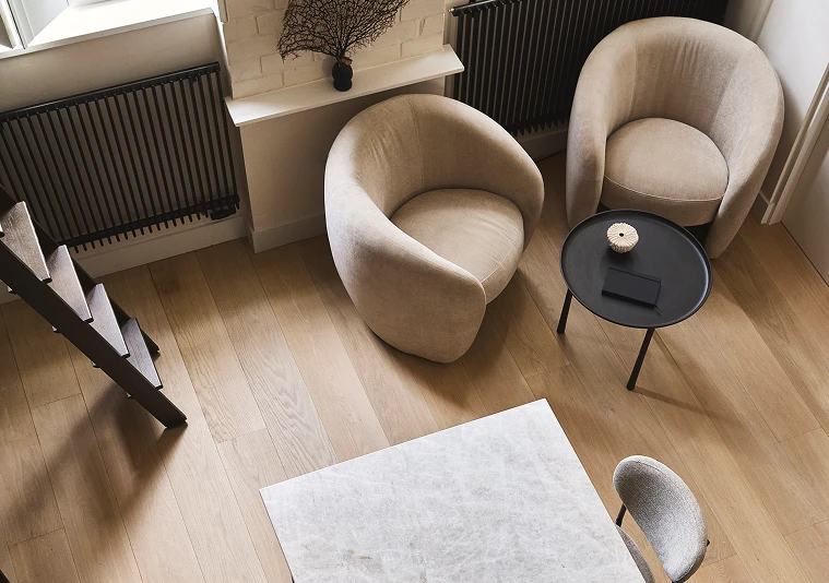
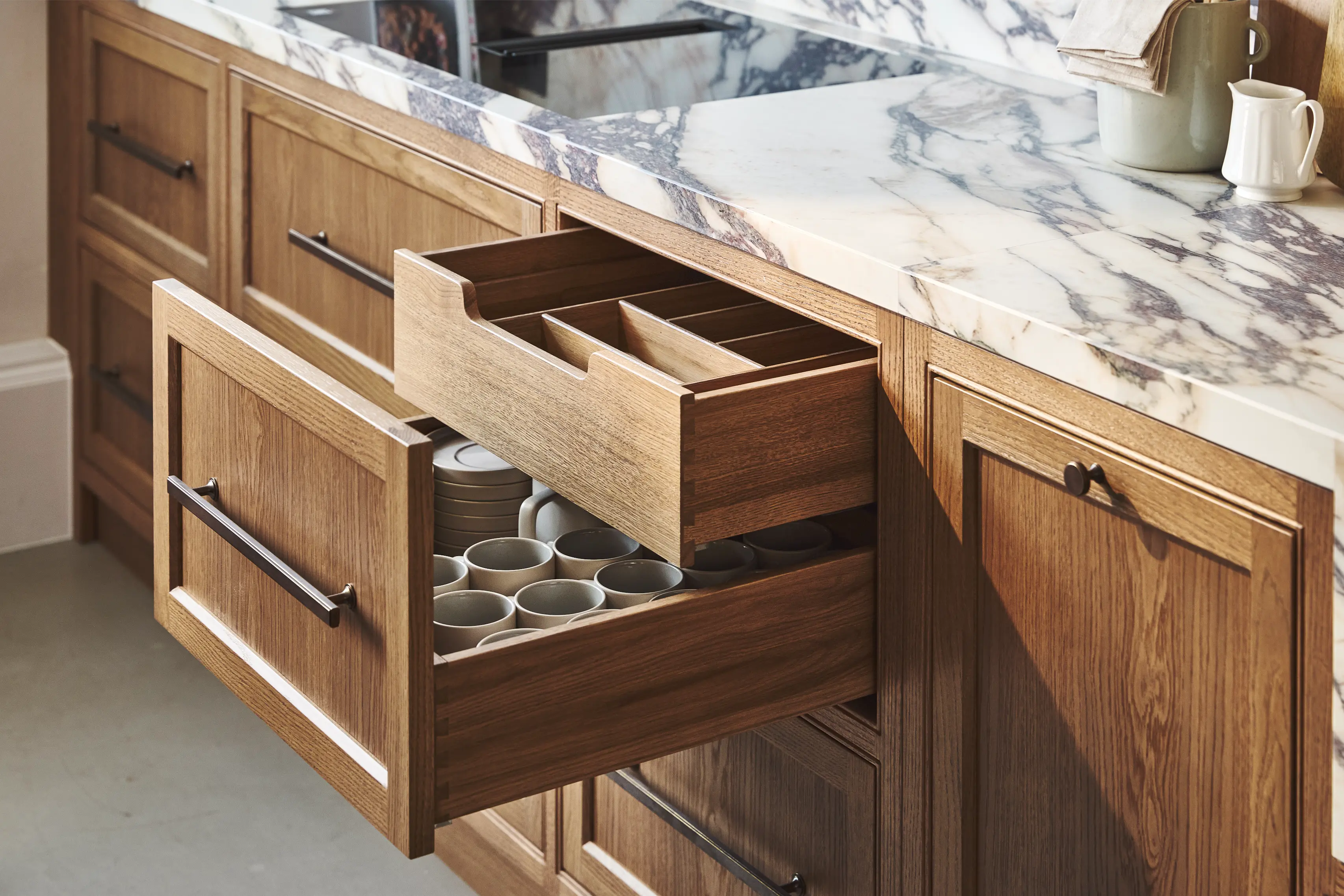
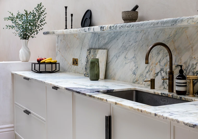
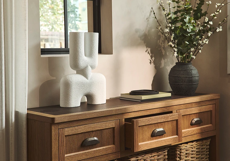
Matthew recommends pairing oatmeal cabinetry with unlacquered brass, aged oak, honed quartz or travertine, with tactile materials such as linen or bouclé for seating. The combination brings warmth and texture without making the kitchen feel overly polished.
As Matthew puts it, “Warm metal, natural stone and oatmeal cabinetry is a combination that’s very hard to argue with.”
And perhaps that is why this palette has such longevity. White may have been the default neutral for years, but a warmer neutral can feel like a more deliberate choice. It gives the kitchen enough character to work with changing interiors, artwork and materials over time, without becoming tied to a particular trend.
We’re delighted to see Matthew’s perspective included in Homes & Gardens and to be part of the wider conversation around how we design kitchens to feel good for years to come.